Designing packaging that reflects 50 years of history
without breaking away from the brand’s current image
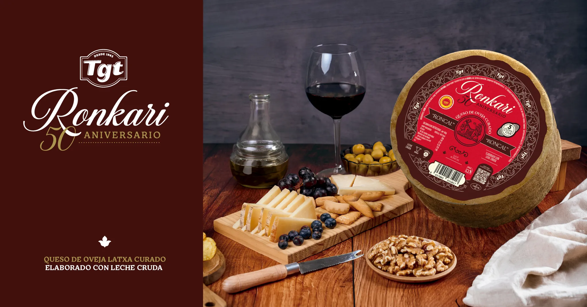
The project aims to reflect the history RONKARI has built over the past 50 years, highlighting a journey defined by a recognisable visual identity closely linked to its origins.
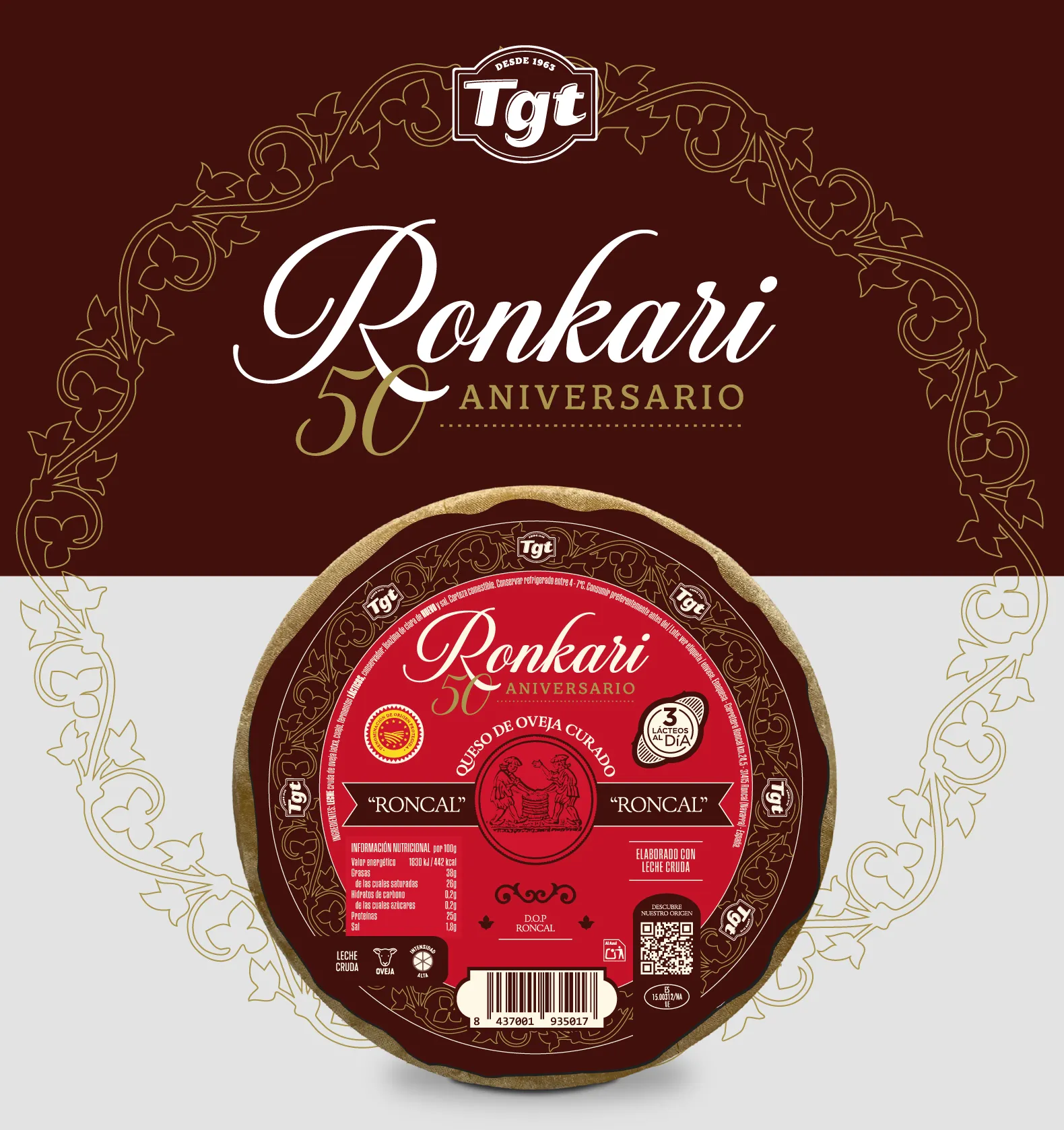
The design draws inspiration from the artwork of RONKARI’s earliest labels, bringing back the brand’s visual essence and adapting it into a contemporary proposal for this commemorative edition.
All of this is brought together through an aesthetic that gives the brand a distinctive look and feel, both classic and modern, connecting its visual heritage with a renewed image to celebrate its 50th anniversary.
A special edition that celebrates its origins
and opens the door to new product lines
The first step was to create the identity for this anniversary edition, starting with the logo featured on the packaging, which was then applied across the different launch communication materials.
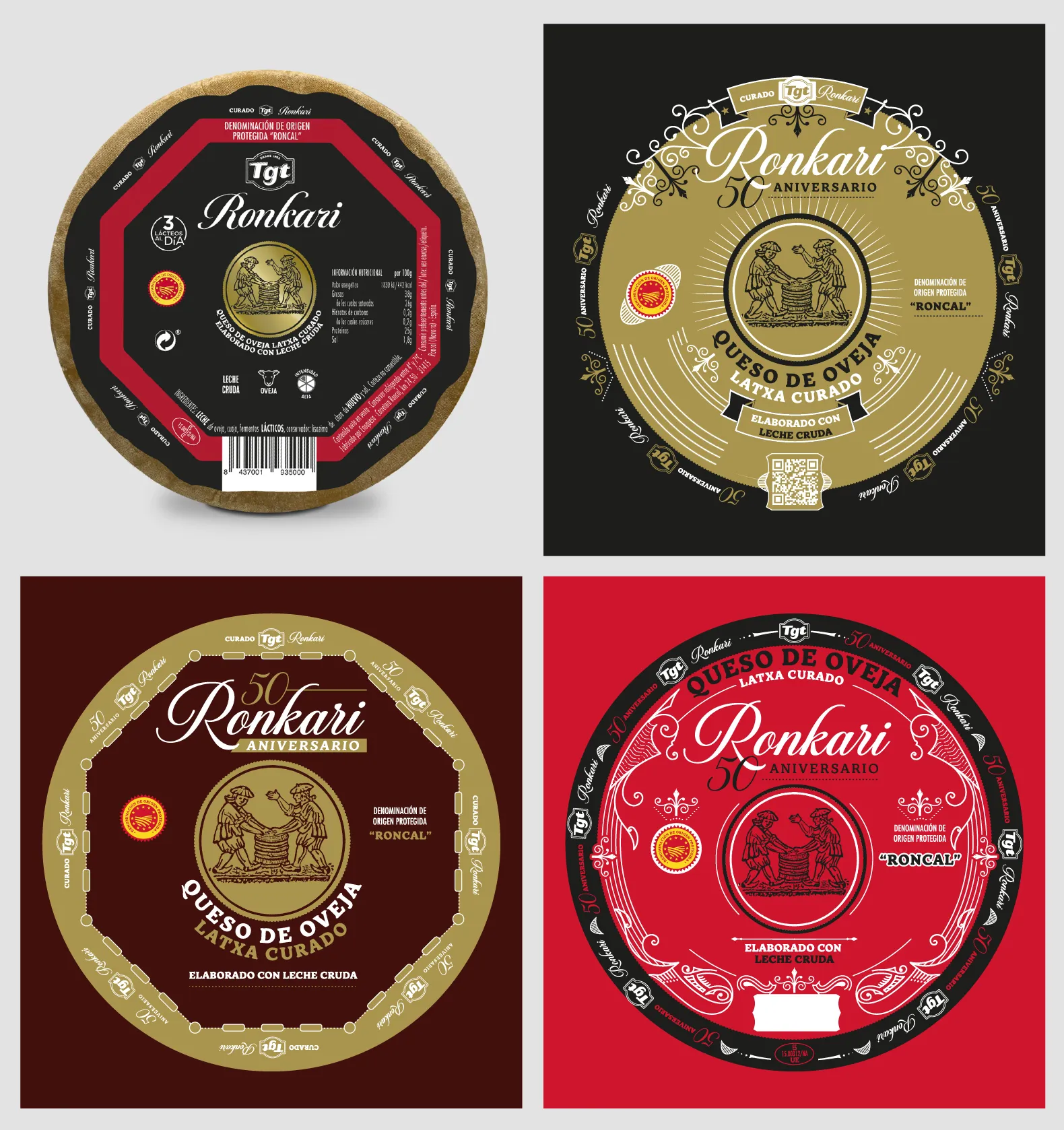
The design proposals included different graphic, colour and typographic approaches, always aligned with the project’s initial requirements. The edition was adapted to the brand’s different product references and formats.
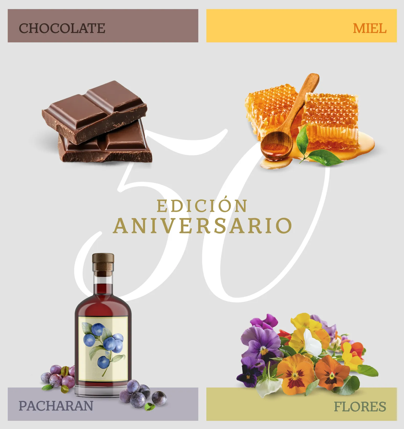
The initiative became the starting point for bringing new products with different flavours to market, with a focus on innovation and originality. The launch was supported by press coverage, events and tastings.